 Today,I felt like doing something different than just simply editing a photo to make it look slightly better than if it wasn't. I had took the original photo of this flower yesterday and decided to make a GIF of it. Firstly, I had cropped (selected) the flower by itself, then started creating duplicate layers of it. Then for each duplicate layer, I had changed the hue and saturation to create a different color of the flower, and for reference the original color of the photo was yellow. Lastly for each layer, I add .5 sec for the time stamps.
0 Comments
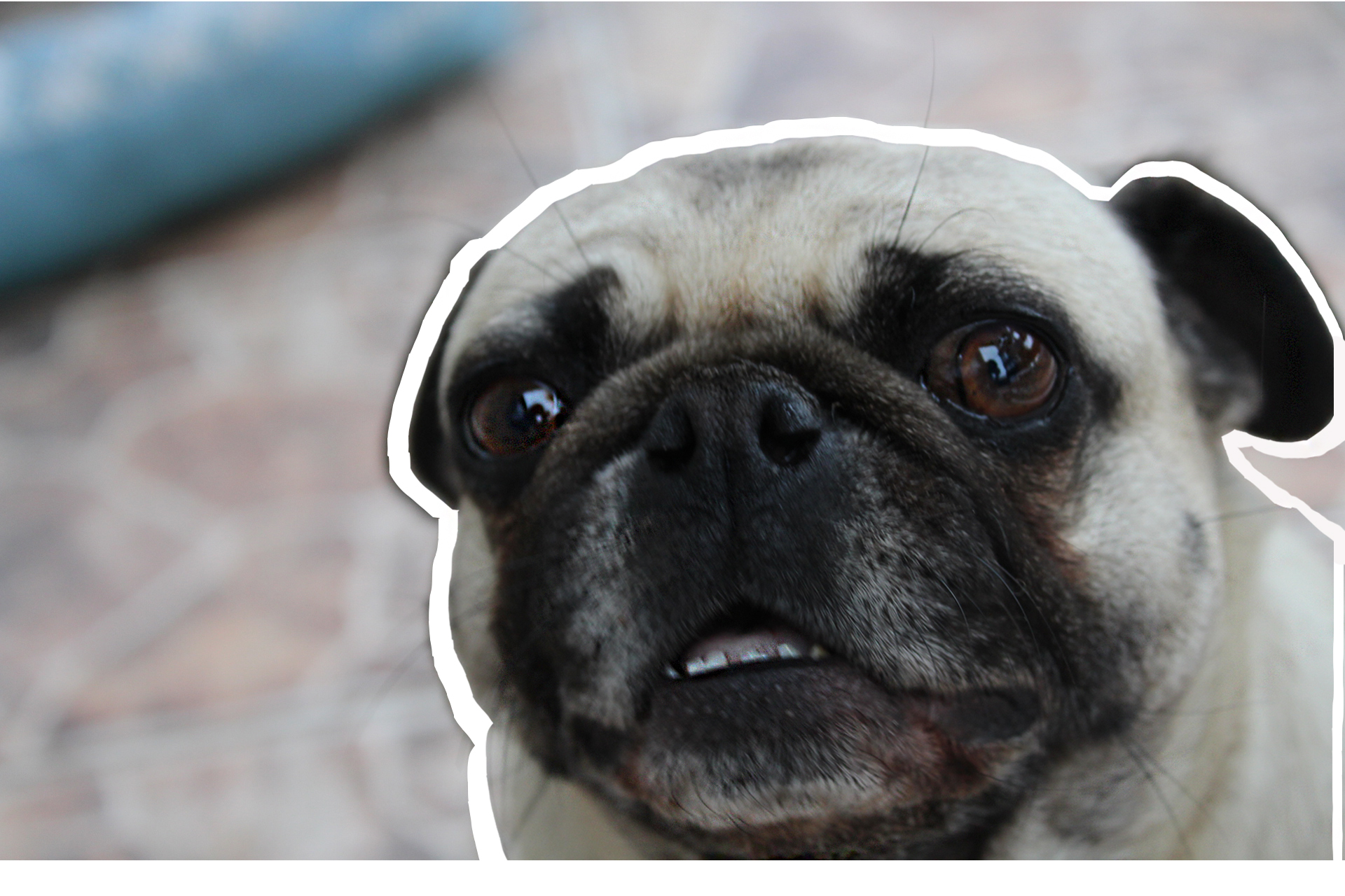 Uhhh. | Taken and edited by Joshua Ibasco. | Nov. 29, 2016 Today, I had decided to edit a photo of my pug that I took yesterday. With this edit I had cropped my pug first, then transformed it to be slightly smaller than in the original image, giving off the effect of my pug having a white outline around her. Then I had sharpened the image slightly. Overall, I believe that this adds more emphasis on my pug as being the main focus of the edited photo.
 Sadly, I didn't really do anything spectacular, and get that amazing of photos over break due to my parents not planning ahead and being busy with work. However, the best part, that many can agree with, was the food. The food was amazing itself, and eating with the family topped it off.
Since I've been using Photoshop for a while, I decided to switch it up and use Google Photos to edit the picture of my pug. Since the last time I've used Google Photos, they've updated it by adding more new filters, however removing the old ones at the same time. The filter that I have used was Vogue, which had given the photo a vintage look. Then they had also added more tools to where you can mess around with the lighting, exposure, saturation, and etc, so I had dabbled with it, including me cropping the photo slightly, which led me to my final product, the photo on the left.
With the two photos above, the right one was the one that I had edited and the left photo was the unedited version. I had used photoshop to edit the one on the left. I then had used Color Balance, Exposure, and Channel Mixer to create the different colors. With this edited photo, not knowing it was edited and the photo to the right of it, by itself, it would look like as if it was just a typical photo of a bundle of different flowers.
And for this edit, I had decided to make a logo for one of my friends. And for this I had chosen a random photo of a dolphin jumping in the air with its reflection on the water. And I tried to do the same concept with the name.
With the two logos above, were my first time ever dabbling with graphic design. I believe that I did decent for a noob. Despite me taking two days to try and figure out how to do it, I was finally able to complete two, explaining why I didn't upload a blog yesterday due to the computer being slow.
 Since my trial ended for Photoshop last week, I wasn't able to use it to edit my photos. Since then, I have been using Google Photos to edit the photos, which is alright but not up to par with how Photoshop could edit and make look photos look better. With this photo above I've added a tad bit more color to it and a lot of pop, then finally I used the Pluto filter to make it look more dramatic and pleasing to view.
|
PhotographerJoshua Ibasco is a simple person that, on rare occurences, likes to add a little snazzy edits to his photography. Archives
May 2018
Categories |


 RSS Feed
