 Nick V. posing. | 2/24/2018 This is a photo I took of my friend Nick. The focus of the photo is pretty good, however the composition isn't. I should've moved close in or cropped the photo to make the Nick more of the star/subject of the photo. The colors of the photo is good and the textures too.
0 Comments
 Chyle looking off to the side. | 2/23/2018 | Photo: Joshua Ibasco This photo, I believe is really good. It contains a story, and has emotion as well. This photo is also fine artsy. The focus and the composition of the photo is very good as well, as I purposely composited the photo to have half of his face in the center of the photo. The colors of the photo is good as well. Additionally, the flash from my camera wasn't that strong as it there wasn't too much flash where it would make the photo look overexposed.
 With the boys at Proctor Valley. | Taken and edited by Joshua Ibasco. | 2/23/2018 This photo was taken on my camera on my friend's tripod. I was the one who set up the camera on the tripod to take this photo. The flash on my camera isn't that designed to brighten long distance areas, so that's why our faces are slightly dark. I could possibly make our faces and our body's brighter, however that would just make the photo more grainy, and not look that good. However, the composition of the photo is good, as well as the colors and textures. There are some things that I couldn't fix in this photo, but overall, I like the photo.
 To the moon. | Photo: Joshua Ibasco. | 2/19/2018 I really like this photo. I took this photo with my 75-300 mm lens and with the help of my tripod. This is as much as I can zoom in and be in focus. I purposely centered the moon while I was trying to compose the photo. The colors of the photo is decent as well. There is also some textures in the photo of the moon.
 Matt looking down upon his work. | Taken and edited by Joshua Ibasco. | Feb. 17, 2018 I really like this photo and believe that it's at competition standards. This photo has perfect focus and composition with my friend, Matthew, being the center and main subject of the photo. I added the black and white filter to add a timeless effect to it. Despite this photo being somewhat simple, the photo has a lot of story and emotions attached to it.
 Nick aspiring for a better life. | Taken and edited by Joshua Ibasco. | 2/12/2018 I feel like this is one of my best Photoshop edits I have ever created. My original photo is of my friend Nick from the back, however the photo of the shining forest isn't. The focus and composition of the photo are competition worthy. The colors of the photo is pretty good as well, as I purposely desaturated the photo on purpose.
 Sam loving Naruto. | Taken and edited by Joshua Ibasco. | 2/7/2018 This is the first time I had used double exposure editing on Photoshop. I believe it came out good. The original photo is decent, as I placed my friend right in the center.
 Ski lift to the top of Snow Summit. | 1/27/2018 This photo was taken on a ski lift to the top of one of the slopes at Snow Summit. I believe this photo is pretty good. I purposely centered the people in front of us in the chair. There is a good use of lines in the photo as well. The focus and composition are decent as well. The sun glare in the bottom left and top right adds into the story of the photo.
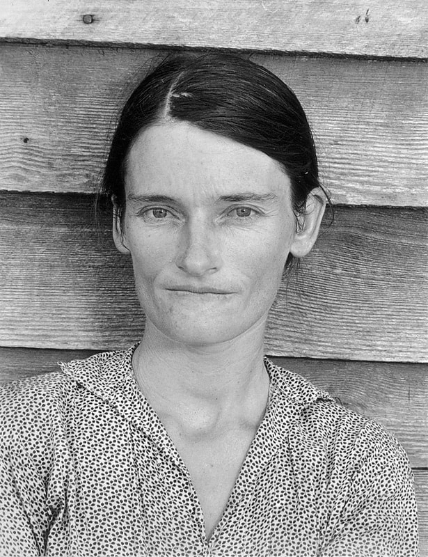 Walker Evan's photo of Allie Mae Burroughs, a symbol of the Great Depression. The photographer of the week is Walker Evan. He focused primarily with documentary and journalism type of photography. He mainly captured the image of the Great Depression, of how people during those times experienced it. With the image above, is of Allie Mae Burroughs, which was sort of the face of the Great Depression. The image is slightly off in composition, however it adds into the story of the photo. The emotion in Allie's face also adds into expressing the main feeling in everybody during the Great Depression.
 Hannah is sad for some reason. | 1/27/2018 I would say that this is a pretty decent photo of my sister. I composited her to be in the middle purposefully. The colors of the photo is pretty good as well with the textures. The focus is pretty good, as I was able to get the photo to around 6 MB. One of my favorite parts of the photo is the sad face my sister is giving, as it gives the photo more life and a story to it.
|
PhotographerJoshua Ibasco is a simple person that, on rare occurences, likes to add a little snazzy edits to his photography. Archives
May 2018
Categories |
 RSS Feed
